Redefining UI/UX patterns for meter data management software
The largest project I’ve been working on is the redesign of our major software product, EnergyIP Mosaic, a meter data management system. One of the largest problems we had to overcome was understanding how to best restructure our application. We started from scratch, and aimed to solve the biggest problems our users had with our old UI.
Note: I will focus on the user experience aspect of the redesign and not include technical, schema related changes.
Project Timeline: Jan 2019 - Feb 2021
Inherited problems
There were several use cases that were not well handled with the old UI, determined through conducting many customer interviews and workshops over several years. The users’ largest complaint was that using our UI was extremely time consuming! Therefore, our biggest aim was to improve our users’ task efficiency! Below were the top three issues that we identified that would best help meet this goal.
Easily search and browse
Our old application was tailored to automation and did not consider users needing to manually search for specific items and compare them with each other. It was a laborious process to click into the details of a specific item and then navigate back to the original list.
Improve findability
The old UI had many pages that were all placed in different sub applications. Users had to rely on their experience with the UI to remember where pages were. This made it difficult especially in cases where they were trying to find something different than usual.
Flexible configurability
Each customer had a different way of doing their work which forced us to do many customizations that could not be added to the product itself. We needed to find a way for each customer to be able to customize certain areas for their business, but not increase our development costs.
What workflow would best enable the user to search and browse their results?
How can the user easily discover pages that they need?
How can the user tailor a generalized application for their specific business purposes?
Ideation and analysis
Part 1: easy search and browse.
Users needed a way to browse and compare arbitrary results, and perform dynamic and configurable searches. With this use case in mind, our team would construct user journeys and draft interaction design patterns by white-boarding with stakeholders. While comparing our usage pattern with other software, we found that the Microsoft Outlook design for browsing email was similar to our design requirements. Our team eventually came up with what we call “the 3 amigos” pattern. Users would not need to wait after they select a new item for the page to reload the details. To the right is a GIF of search was conducted in our old UI.
This pattern consists of 3 sections:
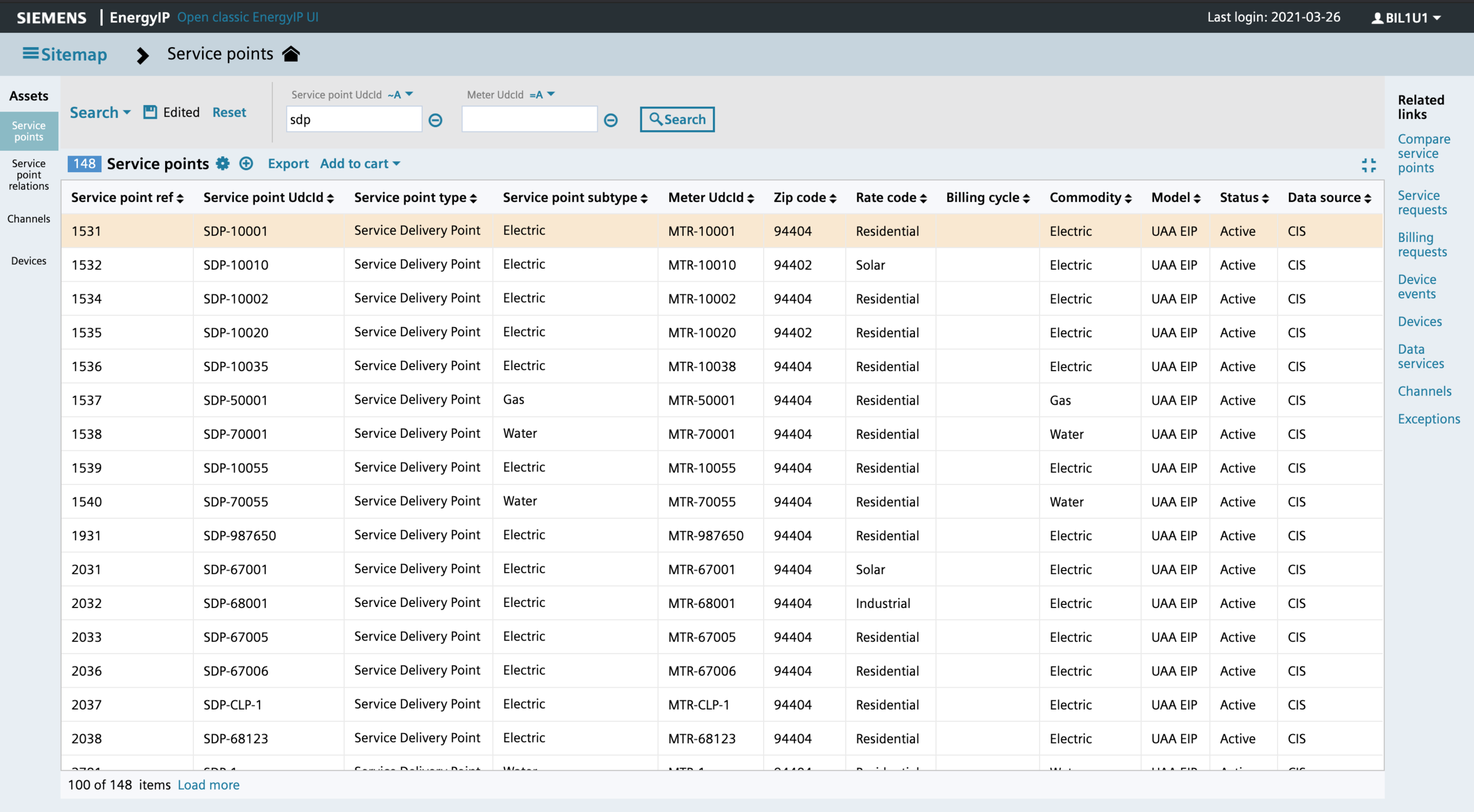
Search + list : This view makes it easy to compare results by column.
Details only: This view shows the details in full screen, especially useful when there is high information density so the user can see charts and tables in better detail
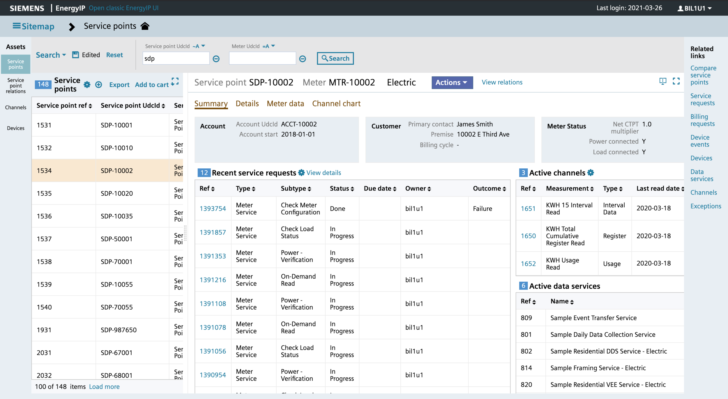
Master details: In this view, users can search, see results, and view the details of a selected item all together. This enables the browsing capability users were missing before. When users easily move through the list, they can see the details for each and compare them with each other.
part 2: Improve findability
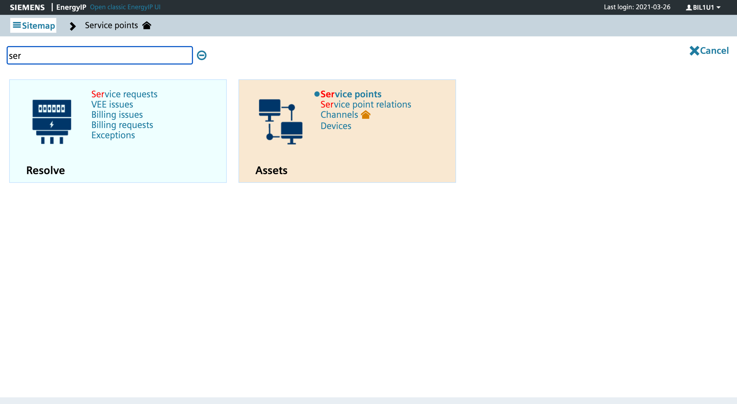
Our users were experiencing high cognitive load when searching for pages used less frequently because our old UI had each page under many subgroupings. One of our ideas was to have a centralized location for users to find different pages. Therefore, we created a sitemap that grouped pages by function and included the ability to search by page name. By flattening the hierarchical structure of pages and consciously limiting the number of sub groupings, we decreased users’ navigation time and effort.
part 3: flexible configurability
The unique part of having utilities as customers is that each utility has its own way and preference of managing their work. We were able to acquire several versions of their “day in the life” workflows by having multiple customer meetings. We compared each version to analyze in which areas they were similar and where differed. Combined with feedback from previous customer conferences, we were able to create a comprehensive list of top areas in our product where we needed to build in customizable features for users. This would allow users to better integrate how they use our product in conjunction with other software like their customer information system. Some of these areas are listed below:
Configuring what search criteria they want to use
Creating saved searches
Preserving columns shown and hidden for all lists
Choosing their landing page
Default shown and hidden detailed fields
For more details on how I ran customer ideation workshops, refer to this page.
Building wireframes and prototypes
Our ideation mockups and low fidelity wireframes were created using Balsamiq. The purpose of these were describe the functionality of each element on the page and were not created to demonstrate visual styling accuracy.
Instead, we used HTML/CSS and some javascript to do our high fidelity prototyping.


Feedback
To test if our new designs improved users’ task efficiency, we ran several timing tests internally. We completed specific tasks in the old UI and timed how long they took. Then we would complete and time the same task in the new UI and compare the differences. The results were astounding.
Unfortunately, during this time, we did not have direct access to end users; we had to make due with several proxies from our professional and delivery services team who regularly worked with our customers’ support teams. However, when we had the opportunity to demo our designs to our end users, they were impressed with the optimizations to the point where they began preparing their systems to upgrade to our new UI when it became available.
Below is a sample result of timing tests:
Simple Task: search for an item, view its details, return to the list, and view details of another item.
Old UI: 48 seconds
New UI: 18 seconds
Right image show more sophisticated task flows related to browsing and fixing data.
Overall, the new UI allowed users to perform simple tasks twice as faster and complicated tasks 8.5X faster!
What we shipped
After we applied our styles from our design system our design, here was our final look to address each design problem:
Easy search and browse: 3 amigos pattern


Improved findability: Created a sitemap with ability to filter for pages based on name


Flexible configurability: Created saved search mechanism and defined UI implicit save features


Next steps
Migration from our old UI to the new UI has been happening in mulitple development phases and will continue for the next couple of years. Our first customer is expecting to implement a pilot version by September 2021! We will be working closely with them to receive any feedback so we can incrementally improve our product.


